In an increasingly digital world, having a responsive website that looks great and works well on all devices is essential. But how do you ensure your web design looks great and performs optimally on every device?
This guide to responsive web design will answer this question, helping you create a website that functions perfectly no matter what device it’s viewed on.
From understanding mobile browsers and identifying touchscreens to using fluid grids and hiding content, this guide has everything you need to create a stunning, user-friendly, responsive website. So, let’s get started – your website awaits!
What is Responsive Web Design?
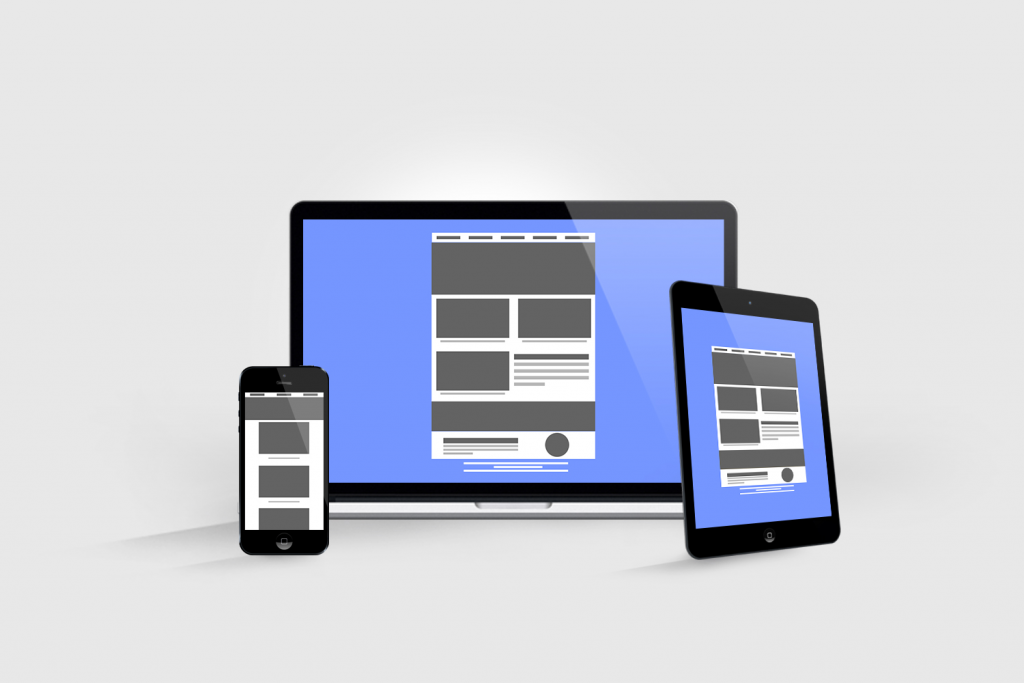
Responsive web design is an approach to designing a website that ensures your target audience, regardless of device or browser, has the best possible experience when interacting with your website.
Developed by Ethan Marcotte in 2010, this design method focuses on creating websites that automatically adjust their layout and content according to the user’s size and type of device.
Responsive designs can be achieved by using the following:
- Flexible layout grids
- Fluid images
- CSS (Cascading Style Sheets) and media queries
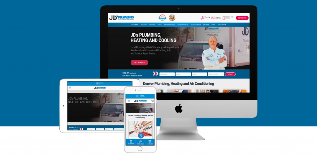
These allow for content to be rearranged depending on the screen size and viewport size. This ensures content remains visible and easily read on various devices, from desktop computers to mobile phones, without creating separate mobile-first approach for each device.
By creating one website that works across various devices, responsive web design helps you reach more of your target audience while providing them with a great experience no matter their device.
Benefits of Responsive Web Design
- Responsive web design improves user experience across all devices.
- It saves time and money by eliminating the need for separate mobile and desktop designs.
- It increases website traffic and improves search engine optimization (SEO).
- It allows for more flexibility and adaptability in the design and content of the website.
Responsive web design is invaluable for optimizing website performance and user experience. By creating a single website that automatically adjusts itself to any device or browser, the responsive design eliminates the need for separate mobile versions of your website. It ensures all users have a seamless browsing experience no matter what device they use.
This mobile and desktop approach also helps you save time and money since you only have to create one site instead of multiple mobile versions.
Responsive design also helps improve search engine rankings, allowing Google to crawl your site regardless of device or viewport size easily.
By providing a consistent viewing experience across devices, responsive web design also increases customer satisfaction and loyalty, allowing you to attract your target audience while improving their overall web experience.
Responsive vs. Adaptive Design
Adaptive and responsive design strategy are two popular methods to optimize a website for different devices and screen sizes. While both approaches serve the same purpose, they have distinct differences.
- Adaptive design involves creating multiple independent website versions tailored for specific devices or modern browsers. This approach requires more development time and money to create multiple sites but gives designers more control over how the site looks on different devices.
- Responsive web design uses fluid grids, flexible images, and CSS media queries to adjust a single website to any device or browser automatically.
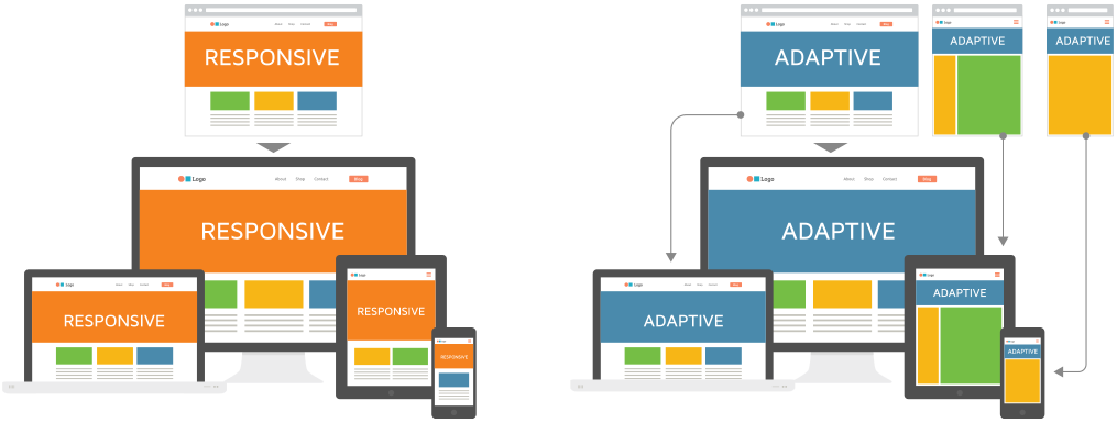
This approach eliminates the need for separate mobile versions of your website. It ensures all users have a seamless experience no matter what device they use while saving time and money in development costs. Ultimately, it depends on your needs which approach is best suited for your project; however, if you want to reach more users while improving their overall web experience, then responsive design is likely the better option.
The evolution of responsive Design
Gone are the days when web design was simply about making a website look pretty. Today, savvy web designers understand the vital importance of responsive design – an evolution of web design that has fundamentally changed the way we view websites.
With the rise of mobile technology, web design had to evolve to keep up with the massive proliferation of smartphones and tablets. This is where responsive design comes in. It’s all about designing websites that automatically adapt to different screen sizes and devices, providing users a smooth and seamless experience, no matter how they choose to access the website.
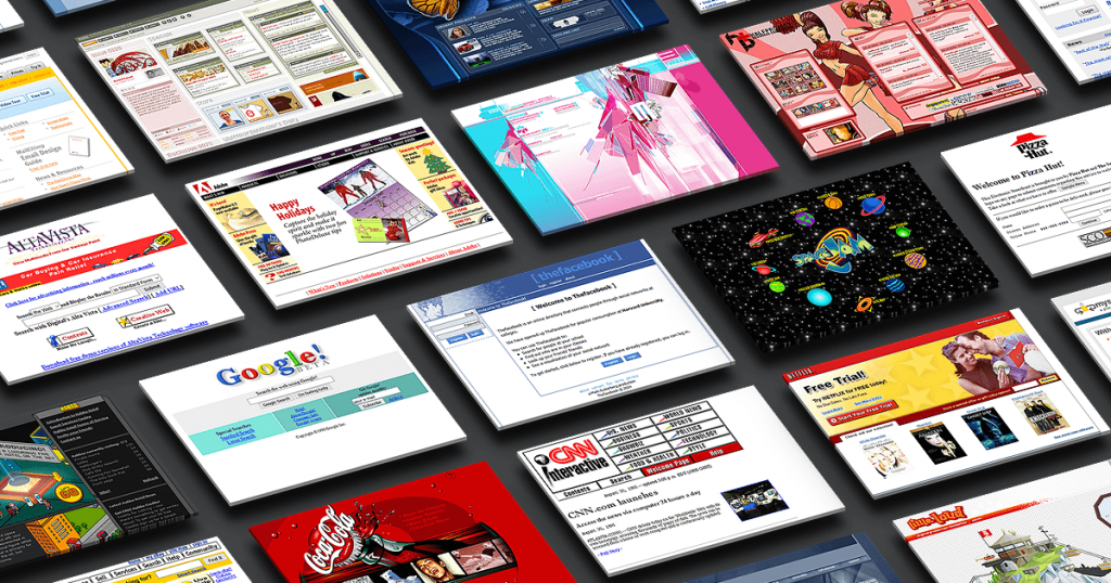
At its core, responsive design is all about one thing: fluidity. By using flexible grids, flexible images, and CSS media queries, responsive design allows websites to stretch and scale to any screen size. No more worries about users having to zoom in and out just to read your content or struggling to navigate your site on smaller screens. Responsive design means your site will always look great, no matter what device your users are using.
But the benefits of responsive design go beyond just aesthetics. In fact, responsive design can actually help boost your search engine rankings. Google, for example, has stated that mobile-friendly websites are a top priority and will rank them higher in search results. You’ll take a big step towards better SEO by using responsive design on your website.
But what about the user experience? After all, responsive design is ultimately about creating a seamless experience for your users. By using responsive design, you’ll provide your users with a fast and easy experience that won’t lead to frustration or impatience. Increased engagement, lower bounce rates, and higher conversion rates are all benefits of responsive design.
Of course, implementing responsive design requires a bit of technical expertise. But that’s where the benefits of working with a professional web designer come in. A good designer can help you create a responsive website that’s optimized for your users and your business goals.
So if you want to take your website to the next level, consider the power of responsive design. It’s the way of the future, and it’s not going anywhere anytime soon. You can create a beautiful, user-friendly website that delivers results with responsive design.
Summary
- Responsive web design has fundamentally changed how we view websites, adapting to different screen sizes and devices.
- By using flexible grids, images, and CSS media queries, responsive design allows websites to stretch and scale to any screen size, providing a seamless user experience.
- Responsive design can also help boost search engine rankings and increase engagement, lower bounce, and higher conversion rates.
Understanding Mobile Devices and Browsers
Understanding mobile devices and browsers is essential for responsive website design in the current digital landscape. Mobile users are no longer limited to a single platform or device; they can access websites from various devices with different viewport sizes.

As such, designers must create a website that can respond to these changes and automatically adjust itself accordingly.
Ethan Marcotte’s concept of responsive web design has become increasingly popular due to its focus on using flexible grids, fluid layouts, and responsive breakpoints to ensure a website looks great on any device or browser.
Additionally, utilizing real estate wisely by including white space and optimizing images is key in ensuring users get the most out of your site regardless of their preferred device.
With the right approach, you can create an engaging experience for all visitors while ensuring they have access to all the same content as desktop user designs.
Key Takeaways:
- Designing websites for mobile devices and browsers is crucial for responsive web design.
- Responsive web design uses flexible layouts, fluid layouts, and responsive breakpoints to ensure a website looks great on any device or browser.
- Optimizing images and using white space wisely can help create an engaging experience for all visitors, regardless of their preferred device.
Screen Sizes and Browser Windows
Screen sizes and browser windows are essential components of responsive web design. Different devices display websites in different ways, with varying viewports and dimensions.
To ensure a consistent experience across all devices, designers must pay special attention to screen size and browser windows.
By considering various screen sizes, browser windows, and device types, designers can create an consistent user experience without compromising usability.

Key Takeaways:
- Responsive web design requires designers to consider screen sizes and browser windows for different devices.
- Consistency in user experience can be achieved by paying special attention to these components.
- Considering various dimensions and viewports can ensure usability and an optimal user experience.
Viewport Size: The Key for Adaptation
Viewport size is an essential factor in website design and development. It is the width of a device’s screen in pixels and determines how much content will be visible on the page. By considering the viewport size, designers can create websites tailored to fit various devices, ranging from desktop versions to smartphones and tablets.

This is especially important when creating mobile versions of websites, as different devices have different viewport sizes and require different layouts for optimal viewing.
By keeping viewport size in mind during the design process, designers can ensure that all users can access an optimal experience regardless of device type or viewport size.
By understanding what device types and viewport sizes are being used by visitors, designers can create websites that will adapt accordingly. This type of design also requires careful consideration regarding content hierarchy and layout to ensure the most critical information is visible no matter the screen size.
Additionally, designers must consider how responsive images appear on different devices, as they can often be distorted or lose quality when resized for smaller screens.
Creating a responsive website requires a deep understanding of user needs and device capabilities to provide an optimal experience for all visitors regardless of device type or viewport size.
Key Points:
- Viewport size is crucial in website design and development, determining how much content will be visible on a screen.
- Designers must consider viewport size when creating mobile versions of websites to ensure optimal viewing on different devices.
- Responsive website design requires careful consideration of content hierarchy, layout, and image resizing to provide an optimal experience for all visitors.
Screen Real (Estate)
In today’s digital world, businesses are fighting tooth and nail to grab a piece of the screen real estate. But what exactly is screen real estate? Simply put, it’s the amount of space that your website or app occupies on a user’s screen. And while it may seem like a small factor, it can make all the difference in whether or not a potential customer engages with your brand.
When it comes to screen real estate, size does matter. The bigger the space you occupy on a user’s screen, the more attention you’re likely to receive. But it’s not just about how much space you take up; it’s about how you use that space. A cluttered or confusing layout is likely to turn users off, no matter how much screen real estate you have.
So, how can businesses maximize their screen real estate? By creating a clear and intuitive design that guides users where they need to go. This means organizing content in a logical way, using clear calls to action, and providing a seamless user experience across devices.
But it’s not just about design – content also plays a crucial role in occupying screen real estate. Search engines like Google increasingly prioritize websites that provide high-quality, engaging content. This means that businesses need to be strategic in how they present their content, using compelling headlines, attention-grabbing visuals, and informative copy to capture users’ attention.
So, if you’re looking to make a splash in today’s digital landscape, don’t overlook the importance of screen real estate. With the right approach, businesses can occupy that valuable space and engage with customers in a meaningful way.
Summary:
- Screen real estate refers to the amount of space a website or app occupies on a user’s screen.
- A clear and intuitive design, along with high-quality content, helps businesses maximize their screen real estate and engage with customers.
- A cluttered or confusing layout can turn users off, regardless of how much screen real estate a business occupies.
Layout
The layout is essential to any website design and is especially important for creating a responsive website. By using flexible grids and fluid image size, designers can ensure the site looks good on multiple devices with different viewport sizes.
White space should be used strategically to maintain legibility and clarity. It’s also important to consider how content hierarchy will change as the device size changes to ensure visitors can quickly find the information they need, no matter their device.
Navigation
Navigation is a crucial element of any website design, and it’s especially essential for creating a responsive website. It’s important to consider how navigation looks and functions differently on devices like laptops, tablets, and mobile phones.
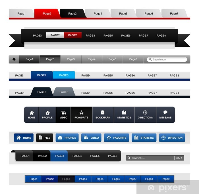
On larger screens with a trackpad, navigation bars along the top or side of the screen are easy to use. However, once the device gets small enough to be held one-handed, users will expect one-handed functionality, which can mean having the navbar at the bottom of the screen when they reach a mobile breakpoint.
Designers should also consider that thumbs have different needs than fingers when it comes to usability; generally speaking, buttons should be at least 50 pixels wide in width to be easily tapped by thumbs.
Key Points:
- Navigation is a crucial element in creating a responsive website design.
- Navigation bars should be placed at the bottom of the screen for one-handed functionality on mobile devices.
- Buttons should be at least 50 pixels wide for easy tapping by thumbs on mobile devices.
Defining Typography
Typography is an integral part of web design and is especially essential for creating a responsive website.
Responsive typography requires fonts that can adjust to different screen sizes and devices. The font size must be relative to the parent container’s max-width property to read text on any device easily.
CSS media queries offer unit rems that act relative to the HTML element and makes it easier for font sizes and input fileds to adjust with respect to other elements on the page.
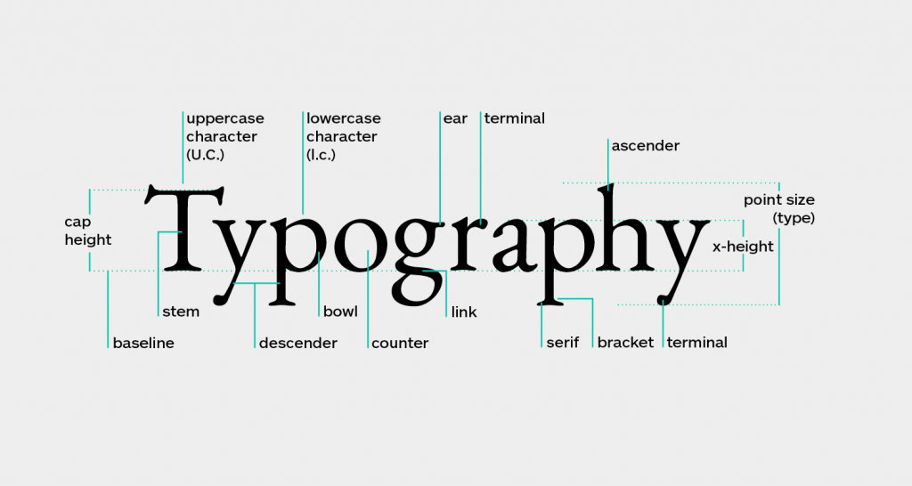
Designers should also consider white space when designing responsive typography, which helps create a clear visual hierarchy on various devices.
When done well, responsive typography can help make websites look great on any screen size while still being readable.
In Summary:
- Typography is a crucial component of web design, especially for creating a responsive website.
- Responsive typography requires fonts that can adjust to different screen sizes and devices, with font size relative to the parent container width.
- An efficient CSS layout offers unit rems that make it easier for font sizes to adjust with respect to other elements on the page, and designers should consider white space to create a clear visual hierarchy.
Take Touchscreens into Consideration
When creating a responsive website, it is essential to consider touchscreens.
Mobile devices such as phones and tablets are equipped with touchscreens, so websites must be able to adjust to this technology. When designing for touchscreen devices, designers must ensure that all page elements are large enough to be easily pressed with a fingertip.

This means buttons, menus, and other interactive elements must be at least 50 pixels wide and tall (Apple’s recommended size).
Additionally, designers should ensure that their website layout is optimized for use on both mobile and desktop versions since some laptops now come equipped with touchscreens.
By considering these factors during the design process, businesses can ensure that their website looks great and functions properly on any device resolution or screen size.
Takeaway:
- Responsive web design must consider touchscreens on mobile devices such as phones and tablets.
- Page elements must be large enough to be easily pressed with a fingertip, and buttons and menus should be at least 50 pixels wide and tall.
- Website layouts should be optimized for use on both mobile and desktop versions, including laptops with touchscreens.
Fluid Grids, Flexible Grids, and White Space
Fluid grids, flexible grids, and white space are essential components of responsive grids.
- Fluid grids allow elements on a webpage to respond to the browser size, allowing for an optimal viewing experience regardless of device.
- Flexible grids employ a fractional system allowing multiple columns and rows to be rearranged depending on the screen size.
Making it easy to create websites that look great on both desktop versions and mobile website versions.

White space can help balance out content and make it easier to read on smaller screens. By strategically incorporating whitespace into your layout, you can drastically improve the user interface experience for those accessing your website from mobile devices.
Responsive web design is all about creating an enjoyable and optimized browsing experience for users regardless of the device orientation or screen size; fluid grids, flexible grids, and white space are integral components in making this happen.
Accessibility
Accessibility is a key element in the field of web design and an important part of creating an enjoyable experience for all users.
By keeping accessibility in mind, developers can ensure that their websites are friendly to those with disabilities, low/no vision, language challenges, or motor function limitations. This includes ensuring that content is clearly labeled and easily understood, providing alternative text for images and videos, and appropriately using semantic HTML tags such as headings and lists.
Additionally, developers can use tools such as screen readers to check the accessibility of their websites before they go live. By following these best practices and taking the time to make sure their sites are accessible to all types of users, developers can create websites that everyone can enjoy.
Recap:
- Accessibility is an important concept in web design that ensures all users can enjoy a website, regardless of disabilities or limitations.
- Developers can make their websites accessible by using clear labeling, alternative text for images and videos, and semantic HTML tags.
- Tools like screen readers can help developers check the accessibility of their websites before they go live.
Showing or Hiding Content
Showing or hiding content is an important part of responsive web design. Developers must be able to control what elements are visible based on the size and type of single device used.
This can be achieved through the use of CSS media queries, which allow developers to set breakpoints and apply different styles depending on the viewport size.
Additionally, with modern techniques such as Flexbox and Grid Layout, developers can create flexible grids that adjust to fit any size screen while still conforming to certain design principles.

By using these methods, developers can ensure that their websites look great no matter what kind of device they are being viewed on.
- Responsive web design requires the ability to show or hide content based on the device being used.
- CSS media queries and modern techniques such as Flexbox and Grid Layout can be used to achieve this.
- By using these methods, developers can ensure their websites look great on any device.
Touchscreens vs. Cursors
Touchscreens and cursors are two distinct forms of user input that have existed for a long time.
Touchscreens have become increasingly popular in recent years, but cursors remain integral to the user experience on desktop computers and laptops.
Each has its own advantages and disadvantages when it comes to web design. Touchscreens allow for direct manipulation of elements on the page, making them great for mobile devices where space is limited.

However, they lack precision compared to cursor-based navigation, allowing users to control what they are doing precisely.
Cursors also give users more flexibility when navigating complex websites or applications with multiple layers and menus. Ultimately, developers must consider both input types when creating responsive websites that display well across various devices.
Common Responsive Query Breakpoints
Responsive breakpoints are an essential part of the process when designing for a range of devices. These breakpoints indicate that the website’s max-width property should respond differently to accommodate different browser sizes and mobile users.
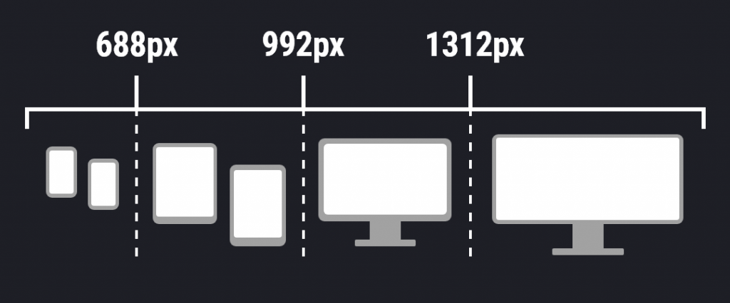
Responsive query breakpoints enable developers to create fluid grids and layouts that adjust according to viewport size, making a website look great on desktop versions and mobile versions.
- 320px (for small mobile devices)
- 480px (for larger mobile devices)
- 768px (for tablets)
- 1024px (for desktop monitors and laptops)
As technology advances, more developers are now including additional breakpoints for tablets, watches, or other devices with varying screen sizes. Creating effective, responsive websites demands careful consideration of how best to use white space and real estate across a wide range of devices while still preserving content hierarchy and clarity.
Common screen sizes
Common screen sizes are an important factor to consider when designing a website. Different devices, such as smartphones and tablets, have different screen resolutions and pixel densities, which affect how content appears on the device.
To ensure a website looks good across all devices, developers must create multiple layouts for each device or use responsive web design techniques.

Common screen sizes include mobile devices such as:
- 360 x 640
- 320 x 480 (iPhone 3GS and earlier)
- 640 x 960 (iPhone 4, 4S)
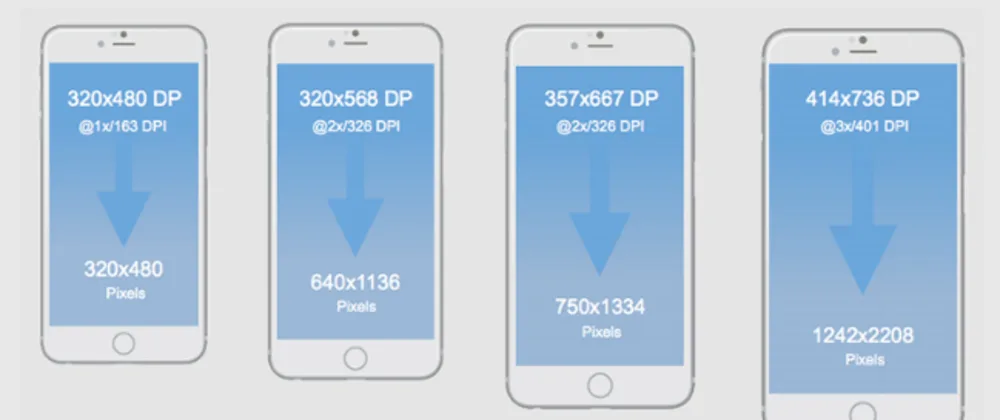
- 640 x 1136 (iPhone 5, 5S, 5C, SE)
- 750 x 1334 (iPhone 6, 6S, 7, 8)
- 1080 x 1920 (iPhone 6 Plus, 6S Plus, 7 Plus, 8 Plus)
- 1125 x 2436 (iPhone X, XS)
- 1242 x 2208 (iPhone XS Max)
- 828 x 1792 (iPhone XR)
By considering these common breakpoints during your design approach, developers can ensure their website looks great and functions optimally across various devices.
Bootstrap’s Responsive Breakpoints
Bootstrap is a popular framework for designing responsive websites that can be viewed on various devices.
It uses media queries to target different viewport sizes and has set breakpoints:
- Phones 576px
- Tablets 768px
- Laptops 992px
- Large desktop screens 1200px
These breakpoints allow developers to create multiple layouts for each device, ensuring their website looks great across all devices. Using Bootstrap’s responsive breakpoints also helps designers create more efficient code, as they can use the same codebase for different site versions.

Furthermore, it allows designers to tweak their site’s layout without needing to rewrite large chunks of code. All in all, Bootstrap’s responsive breakpoints are an invaluable tool for creating sites that look great across a wide range of devices.
Responsive Design With No-Code Tools
No-code responsive design tools are becoming increasingly popular among developers and designers who want to create websites that adjust to different screen sizes quickly.
No-code tools allow users to design fluid layouts and create breakpoints for various mobile devices without writing complex code.
Some “No Code” Tools Include, but are not limited to:
- Webflow: a drag-and-drop editor for building responsive websites without code.
- Squarespace: a website builder that offers templates and customization options for responsive design approach.
- Wix: is another website builder with responsive design capabilities and varioustemplates.
- Bootstrap Studio: a desktop design application that allows users to design responsive websites using a drag-and-drop interface.
These tools often come with pre-built components such as grids, forms, buttons, and images which can be dragged and dropped into place, making it easier and faster to create responsive designs.
No-code tools are invaluable for developers who want to create beautiful, responsive websites without writing code from scratch.
Responsive Web Design FAQ
What are the differences between responsive and adaptive?
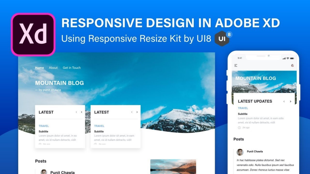
The main difference between responsive and adaptive web design is how they handle screen size changes. Responsive design uses a single layout that adjusts to fit any screen size, while adaptive design uses different layouts for different screen sizes. Responsive design is more flexible and can adapt to a wider range of devices, while adaptive design can be more precise and tailored to specific devices.
What is mobile-first design?
Mobile-first design is an approach to web design that prioritizes the mobile experience over the desktop experience. This means designing a website or application with the mobile user in mind first and then adapting it to larger screens.
The goal is to ensure that the website or application is optimized for mobile devices, which are increasingly becoming the primary way people access the internet. “Mobile-first” design includes considerations such as responsive design, intuitive navigation, and fast load times on mobile devices.
Is mobile-friendly the same as responsive?
Mobile-friendly and responsive are not the same, although they are often used interchangeably. Mobile-friendly refers to a website that is designed specifically for mobile devices, with simplified content and easy navigation.
On the other hand, Responsive refers to a website that can adapt to different screen sizes, including desktops, tablets, and mobile devices. A responsive website will adjust its layout and content to fit the screen size of the device being used.
While mobile-friendly and responsive websites are important for providing a positive user experience on mobile devices, responsive design is generally considered the more versatile and effective approach.
Fluid vs. Fixed layout?
A fluid layout is a type of web design layout that changes size and shape based on the size of the browser size or device screen. It is flexible and adaptable to different screen sizes, making it more user-friendly.
On the other hand, a fixed layout has a set width and does not change regardless of the browser or device screen size. It is less adaptable to different screen sizes and may require users to zoom in or out to view the content properly.
Responsive Design vs. Progressive Web Apps?
Responsive web design refers to a website’s ability to adapt to different screen sizes and devices, providing an optimal viewing experience for users.
On the other hand, Progressive web apps offer a native app-like experience, including offline functionality, push notifications, and the ability to be installed on a user’s home screen.
While responsive design focuses on adapting to different screen sizes, progressive web apps deliver a seamless experience that blurs the line between web and native apps.
Is Responsive Website Design Always Required?
Yes, responsive web design is necessary because it ensures a website is accessible and user-friendly across all devices, including smartphones, tablets, and desktop computers.
With the increasing use of mobile devices to access the internet, responsive web design is crucial for providing a seamless user experience and maximizing engagement and conversions.
Additionally, Google now prioritizes mobile-friendly websites in its search results, making responsive web design essential for SEO and online visibility.
Can I convert my old website and make it responsive?
Yes, updating an existing website to make it responsive is possible. This involves redesigning the website’s layout and coding to ensure it looks good and functions well on devices like desktops, tablets, and mobile phones.
It is important to consider the user experience and ensure the website is easy to navigate and use on all devices.
This may require technical expertise and knowledge of responsive design principles, but many resources and tools are available to help with this process.
Conclusion
In conclusion, responsive web design is essential for ensuring a website is accessible and user-friendly across all devices. It involves creating a website that can adapt to different screen sizes and viewport sizes, making it easier to navigate and use on devices like desktops, tablets, and mobile phones. Responsive web design also helps improve search engine visibility and maximize conversions.
For these reasons, ensuring your website is responsive and optimized for various devices is important.

