Do your website designing skills have that competitive edge to stand out from the rest of over 2.6 billion websites?
To stand out from the crowd, it’s essential to have a website visitors will enjoy returning to occasionally. But it can’t be done overnight, nor by solely building a digital presence. You must incorporate website usability standards and principles, which can’t be done without fulfilling your visitors’ expectations.
Writing great content and having an excellent web design isn’t enough. It would be best to make it accessible and enjoyable for your audience.
But how exactly can you do that?
Your Organization Must Have a Website
Getting online is easy; being successful isn’t. It’s the subtle difference between the two that successful businesses understand.
Wix, WordPress, Squarespace, Drupal, or any other CMS you can think of, requires proper planning to design a website.
- Is your content great? Check!
- Is your website design compelling? Check!
- Is it responsive? Aaah… No!
- Does it load within 3 seconds? No!
The website is disadvantaged even if there was a single No to any of the questions. Imagine opening up a site with awesome content and great page loading speed, only to realize it’s a mess on smartphones! The text and images aren’t aligned well, and you pinch to zoom in on every time you want to read something.
Nobody would visit that site ever again.
Here at Sitewired Web Solutions, we employ a set of website analysis and usabilty guidelines that are incorporated in every website we design and develop for small businesses in Denver, CO, startups, medium-sized businesses, and enterprises. For our website developers in Denver, creating a website is more than just having great content and randomly throwing in good design practices.
What is Website Usability and Accessibility?
Like any other business, website designing demands planning, research, brainstorming, and design principles to make it stand out from competitors.
Website usability guidelines refer to a set of accepted rules to design/develop a website, ensuring it aligns with modern principles.
Every year, these design elements and trends keep changing, and your website needs to be one step ahead of them. These usability guidelines are fresh for 2021 but may change in 2025. In fact, some of these guidelines were not even relevant back in 2010.
Many books have information about UI/UX or user interface design and usability guidelines. But just like you can’t focus on all 200 ranking factors of Google, it’s nearly impossible to do the same for website usability.
Hence, over the past few years, some website design and development elements, such as user-friendliness, responsiveness, page speed, etc., have become sort of a benchmark for anyone looking for a wholesome user experience.
Why is Website Usability So Important?
Business owners need to understand that their target audience is unique from others. Hence, they need to employ a certain set of principles to ensure that the website offers visitors a superior user experience.
Visitors need to feel welcome when they land on a website instead of being bombarded with too much information they can’t handle. Website usability principles are important to implement because they provide the much-needed experience for clients to interact with their websites.
Without further ado, here’s a set of 10 website usability guidelines that you need to follow:
Website Usability Checklist
1. Is My Website Mobile Ready?
With over 50% of the global traffic coming from smartphones, we’re still baffled (read shocked) to see several websites not adhering to this principle. Remember the Mobilegeddon Google update back in April 2015? It was meant to improve search rankings for mobile responsive websites, making it officially a ranking factor for Google. The websites that didn’t consider going mobile important were wiped out by the update.
At SiteWired, we receive many requests from new clients with great-looking websites that are not optimized for a mobile experience. Yup, it’s still happening today.

According to a Forbes article, COVID19 accelerated the growth of e-commerce anywhere between 4 to 6 years. This means the smartphone traffic and the resulting e-commerce surge we see during this pandemic were to be observed by 2024.
E-commerce growth has exploded over the last few months, thanks to smartphone usage during the COVID19 pandemic. And this has resulted in making mobile-responsive websites a huge priority.
Here is the key takeaway from this section:
- A mobile-optimized and user-friendly website should be the first priority.
- More e-commerce spending will be done from smartphones and tablets.
2. Is My Website Too Busy?
A great website design isn’t important but vital. With that being said, it shouldn’t be over-emphasized. In having an eye-catching website, many site owners ignore the importance of keeping their website simple and accessible and instead focus more on the design elements.
Keep in mind that your website visitors are coming to complete an action, such as requesting a query, buying a product/service, or even simply commenting on their favorite blog posts.
To provide your users with a smooth and flawless experience, do not overdo your site with too many colors. 2 to 3 should be enough. We will be sharing some examples of how leading brands deal with colors on their websites.
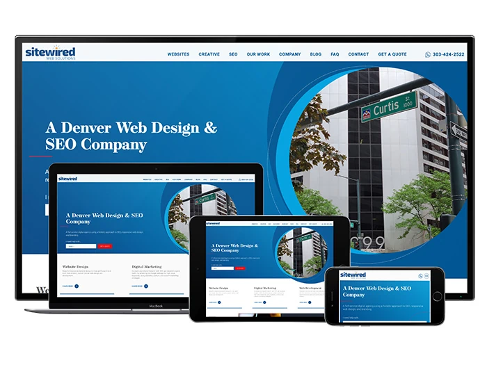
Our own site, for example, is using blue and white as its primary colors, with a dash of red for improving our conversions:
Here’s another example, Apple. The most valuable company in the world at $2 trillion didn’t just happen overnight. Their simplicity, minimalistic website design, and robust copy are all testaments for the company’s success.
Leveraging the power of white spaces, you will never find anything abnormal or even excessive content. Using a data-driven approach and rigorous testing, they have found the perfect recipe for success; simplicity!
Here is the takeaway from this section:
- Use a minimalistic approach – No more than 3 colors. The more you use, the more your visitors will get confused.
- No unnecessary content – This applies to written copy and graphics. Before using any, ask yourself a simple question, “Will it help my visitors in a positive user experience?” If the answer is a resounding No, don’t go for it.
- Typography – Use Google fonts. Calibri isn’t recommended.
3. Is My Site Accessible and Easy to Navigate?
We’ve already discussed the pivotal importance of having a simple and mobile-responsive website with a minimalistic approach and not overdoing the design aspect.
Let’s talk about accessibility and users’ ability to easily browse your website and navigate to the pages they want.
Keep into account that over 70% of visitors browse and take action on your website with just one hand.
It is imperative that content, text, graphics, links, and essential website functions need to be placed within your visitors’ reach. While this element can be flexible for desktop websites, there is no margin for smartphone users’ errors. The area space is limited, and they need the best possible user experience from a small screen.
A key aspect of website accessibility is the ability to load from anywhere in the world, on any device, and any time of the day or night. Invest in a good hosting company so that your website remains up and running with lightning speed. Regular downtimes will hurt your organic rankings and credibility as new visitors won’t waste their time coming back again.
Top brands and companies like Apple, Amazon, Microsoft, and many others seldom have downtime making them highly credible in their fields.
Take a look at Yoast SEO’s Website:
They have a great visual hierarchy. Notice how the CTAs pop out, depending on your exact needs. Plus, the hamburger menu on the top right is at an excellent location, adding another layer of primary navigation. Most visitors will take action without clicking the hamburger icon and ensuring they land on the right page; Yoast has done an excellent job in having different CTAs above the fold. Here are some key takeaways from this section:
- Keep your navigation straightforward, simple, and the same across your entire website. Your website navigation should not change once visitors browse the various pages of your site.
- Your footer should also include navigational links.
- Use breadcrumbs whenever possible, but not on the homepage.
- A search box at the top right will help your visitors in finding what they need.
4. Does My Site Have a Visual Hierarchy?
Your website is your first and last impression for new visitors. Give them something to feast on, and they’ll come back. Give them an eyesore, and they’re gone forever. Your site should make it easy for them to find the right information and one way to do this is by employing visual hierarchy.
Having something as simple as a CTR pop out could make your site visually appealing. Here’s an example of Shopify:
If something stands out from the crowd, it’s the Get Started CTA with white text and green background; on the top right and bottom left. Shopify wants to make it easy for you to sign up with an email address and get a free trial for 14 days. This is called visual hierarchy. The reason why Get Started is different in color is the relative importance of this action on the website.
First, a user scans the website from left to right. Second, in the top right corner, companies usually have a login/sign-up page. With the exact same size, green color, and style of the Get Started button, Shopify did its best to ensure new visitors never are confused about what action to take.
5. Am I Using Consistent Layouts
Ever wondered why a Big Mac from London tastes almost exactly the same as the one bought from somewhere in the UAE? With the fact that big food chains slightly alter their recipes to cater to the local tastes, the same is true for websites.
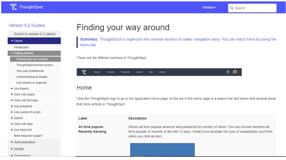
While you should have consistent layouts for all your pages, there are variations expected for the blog page, blog post, landing page, and home page. But this should not be overdone. Every page of your website does not have to be different. Here’s an example of how the help center pages for ThoughtSpot look exactly the same. Regardless of the page, you visit, you’ll find the layout to be exactly the same.

6. Does My Site Project Clarity?
There’s no point in having a fast-loading website if it isn’t clear on the first instance. The core of web usability is creating clear sites. Your website should be clear at first, instead of cluttering it up with useless elements and unnecessary graphics. This point correlated with site accessibility.
In fact, clarity is at the core of every website. Don’t distract or confuse your site visitors. According to research, people are losing their patience, and they don’t have time to wait longer than 5 or even 4 seconds before abandoning the website.
Here’s something else you also need to consider. Our short-term memory is not able to attain more than 9 things at a time. That’s why marketers often remarket to keep their audiences engaged with ads and help to retain the brand value. It’s important for brand recall. You can have anywhere from 5 to 9 elements on your website so that the site visitors’ short-term memory can easily remember and retain what they just saw.
Keep this principle in mind whilst designing a website. Our own site, Sitewired, does not have more than 8 elements.
7. Does it Show Credibility?
Credibility is the single most important asset for any business, far superior to owning assets worth billions of dollars. If your website doesn’t reflect that credibility in its look and feel, visitors will leave and hardly come back again.
Poor design and content make your website highly unreliable. If your site isn’t HTTPS secured and lacks professional content and design, you’ll have a hard time showing yourself as a trustworthy brand. People need to trust you when they read your content. And nobody can do this better than yourself. Grammatical errors, rundown mistakes, and poorly designed layouts all make for a perfect recipe for disaster.
We at Sitewired take our clients’ business credibility at the forefront of our web design process. While designing their website, we don’t use free themes or rely on cheap stock photos flooding the web. Instead, we ask them to send us high-quality pictures of their offices, employees, buildings, etc., as they all connect the brand with their target audience. If it’s real, it has to look real.
If you’re a business, there should be a dedicated page of case studies. Not only do case studies go a long way in helping you reach more audiences through SEO, but they also instill confidence in your visitors.
Here are some tips to improve your website credibility:
- Be clear, honest, and transparent about the products/services you’re selling. Don’t confuse your visitors into finding out about your exact business. Be upfront about how you add value to the services you offer.
- Your pricing page speaks volumes of credibility about your business. SaaS businesses know this very well. Dropbox, Google Drive, Wix, Hostgator, and many more companies providing services on a subscription plan will have a dedicated pricing page. This allows visitors to reduce the time they spend inquiring about prices for each service you offer.
- Do you really exist? How about adding in a Google Map with your physical location and a telephone number with office hours? Most visitors will find it hard to believe you’re a real company if there is no other way to contact you except a boring email address.
- Have an About Us page. Be clear about your company’s history, origins, and why you are in the business.
- If you’re an expert in a specific field, show it to your visitors in the form of certificates, awards, and accolades your business have won over time.
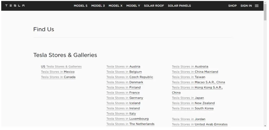
Tesla, the electric automaker making waves for a surge in its stock price, has done a marvelous job in showing its credibility on the website.
Since Tesla is involved in the production of electric vehicles, superchargers, and solar panels, customers need to find a location for the services they need. Their Find Us page is an excellent embodiment of the philosophy. They have 3 sections on one page providing information on stores and service centers across each country. You can click the link and search for the right type of service in that country.

This shows the brand’s professionalism and how it keeps its customers at the center of everything they do.
8. Have I Done a Thorough Testing of User Experience?
Search Engine algorithms are website usability trends, principles, and standards that change from time to time. It makes sense for businesses and website owners to continue to convert them. If these trends are ignored, so will be the businesses.
Even after your website is 100% built and fully functional across all devices, you need to ensure it works flawlessly through rigorous testing. And there are several tests you can run, such as:
- Penetration Testing
- Site speed
- Changing color/size/style of Call-to-Action
- Improving website copy, reflecting modern trends
- Publishing relevant content more frequently
- Researching and adapting to new website usability principles
- Modifying websites for better SEO and rankings whenever Google changes their search engine algorithms.
Only businesses that continually evolve themselves are bound to survive. Others will bite the dust. And here are some of the tools you can use to measure how users behave on your website and what changes you need to implement for better performance:
- Crazy Egg – Founded by Neil Patel, monitors website activity from the users’ point of view through heat maps and scroll maps. While Google Analytics provides information on how many people visited your website, Crazy Egg shows how and where people reacted, giving you a much-needed clear insight.
- The User Is Drink – Pay Richard Littauer to get drunk and review your website. Some business owners received highly valuable reviews from this designer that may not have been possible by other reviewers.
9. Do I have Informative Searchable Content?
Writing for the web isn’t the same as writing an essay. An essay or a research paper is usually written in a very structured format with long paragraphs and a highly formal writing style. Not much of that really applies to web copy.
According to a study, visitors on average review only 20% of the content on your website, which means writing quality content using cool fonts isn’t really going to take you anywhere unless it’s properly formatted.
Use headings, small paragraphs, images, videos, and bullet points to make your content highly scannable, readable, and enjoyable for your audience. Or else it would sound just like another research paper.
10. Conclusion
Website usability isn’t a one-time do-it-and-forget task. It would help if you incorporated the above-mentioned website usability principles to provide an amazing experience to your users. You want website visitors who come in frustrated and leave happy after resolving their problems.

