Welcome to The Ultimate Guide to E-commerce Website Design Success, a thorough source of information for business owners and web developers seeking to enhance their internet stores. As you delve into this guide, you’ll discover invaluable insights on how great ecommerce web design can significantly boost your sales.
We’ll explore critical aspects such as establishing trust through clear language, creating visually appealing product pages, and implementing user-friendly navigation techniques. This guide also provides practical tips on optimizing shopping carts and simplifying checkout processes for an enhanced user experience.
This guide will provide you with comprehensive strategies to help you build or improve effective ecommerce platforms.
Designing eCommerce Websites for Trust and Security
In the digital world, trust is like a golden ticket. When creating a good eCommerce web design, make sure your online shoppers feel safe and secure. If they sense any sketchiness, they’ll bounce faster than a kangaroo on a trampoline. Learn more about the Best Practices for Custom E-commerce Website Security here.
Communicating Trustworthiness Through Clear Language
Good eCommerce web design speaks the language of trust. That means giving shoppers all the deets about your products, being upfront about prices, and keeping your terms of service crystal clear. And don’t forget to sprinkle in some reassuring phrases like “secure checkout” or “privacy guaranteed”. You want visitors to know their info is in good hands with your e-commerce sales.
Throw in some security badges from big names like Norton Secured or McAfee Secure. These badges are like bodyguards for your site, showing customers that you take data protection seriously. It’s like having a guard at the entrance of an upscale establishment.

Oh, and if you haven’t already, get yourself an SSL certificate. It’s like a secret code that encrypts data during transactions, so hackers can’t get their grubby little paws on credit card numbers or login info. It’s like putting your sensitive info in a vault.
To design e-commerce websites, remember: trust is the name of the game. Make sure your design screams “safety first” to users, because without trust, there’s no chance of a successful transaction. And that’s a fact, not just some online shopping myth.
Essential Considerations to Design Ecommerce Websites
The look of your website matters. Research shows that users judge websites within 50 milliseconds. So, pay attention to every detail when designing your eCommerce site.
Importance of Visual Appeal in Web Design
A visually appealing web design can make or break your eCommerce business. People trust and engage with websites that look good. So, create a clean and professional look for your online store.
- Color Scheme: Choose colors representing your brand and making potential customers feel good.
- Typography: Use easy-to-read fonts that match your site’s style.
- Images: High-quality images show off your products and make your site more attractive.
- User Interface (UI): Make sure your site is easy to navigate so visitors don’t get confused or frustrated.

Don’t forget about responsive design. Most people shop on their phones, so your site needs to load fast and look great on mobile. With three seconds or less loading times being the benchmark, mobile users are quick to abandon websites that don’t meet this requirement. So, speed matters.
And don’t neglect SEO. An optimized website ranks higher on search engines, driving more organic traffic and increasing your chances of making sales. Consider hiring professionals like SiteWired, specializing in SEO services, web development, and design.
Frictionless Site Navigation: Because Lost Shoppers = Lost Sales
Smooth navigation is the secret sauce for a delightful online shopping cart experience. It’s like a GPS that guides customers through your eCommerce store, helping them find what they want and buy it without getting frustrated and giving up.

Techniques for Effortless Site Navigation
Once you grasp what your users are seeking, you can construct a framework that meets their requirements. Once you are aware of their objectives, you can construct a layout that meets those goals.
- Simplicity: Keep it simple, silly. A complicated navigation system will only confuse shoppers and send them running. Remember, fewer clicks = happier customers.
- Breadcrumbs: Incorporate breadcrumbs to show users where they are and how they got there. It’s like leaving a trail of digital breadcrumbs to guide them back if needed.
- Categorization: Group similar items together under clear labels. It’s like organizing your closet, but for your website. Shoppers will appreciate the clarity.
- Mega Menus: If you’ve got a boatload of categories and subcategories, consider using mega menus. They’re like the superhero of dropdowns, displaying all options in one big panel. Just like Amazon does it.
And hey, don’t forget about website speed. Slow page load times are the ultimate buzzkill. Use ecommerce tools like Google’s PageSpeed Insights or GTmetrix to optimize your performance and keep shoppers happy.
To sum it up: seamless site navigation isn’t just about looking pretty it directly impacts your conversion rates. Make it easy for customers to find what they want, and watch those sales roll in.
Well-defined Product Categories
The success of a good ecommerce platform depends on customers navigating easily. One crucial aspect is having clear product categories. When similar items are grouped under simple labels, shoppers can quickly find what they want.

Best practices in categorizing products
To create effective product categories, follow these best practices:
- Simplicity: Use simple and straightforward category names. Avoid confusing jargon.
- Predictability: Make categories predictable, so users can easily find items. For example, in a clothing store, have categories like “Men’s,” “Women’s,” “Kids’.”
- Breadth and depth: Offer a variety of products within each category to meet diverse customer needs.
Learn more about creating effective product categorization strategies for an ecommerce store in this comprehensive guide by Shopify.
Well-structured product categories not only aid navigation but also contribute to SEO efforts. Search engines prefer sites with clear organization, making it easier for them to crawl and index content. Good categorization enhances user experience and boosts website performance.
Efficient Product Search Functionality
In the world of e-commerce web development, a good search function is a must. If customers cannot locate the desired product, it can result in lost sales for your business. And that means lost sales for your business.
A well-designed product search helps customers navigate your online store and improves user experience (UX).
Building User-Friendly Search Functions
The key to user-friendly search functions is understanding how shoppers use them. Some type full product names, while others remember keywords or features.
- Suggestive Search: Predictive suggestions help users find what they’re looking for.
- Fuzzy Search: Fuzzy searches account for spelling errors or typos.
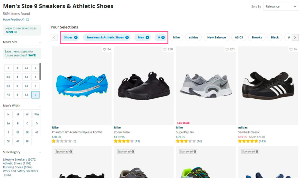
- Advanced Filters: Filters let users narrow down options based on attributes like color, size, brand, etc.
Speed is also crucial. No one likes waiting for slow-loading pages, especially when shopping online. Optimize your site’s loading times using ecommerce tools to keep customers happy.
Implementing Filters For Easier Product Selections
Choosing from a gazillion products online can be overwhelming. But fear not. Filters are here to save the day. They help customers narrow down options and find their perfect match quickly.
How filters make shopping a breeze
Filters simplify the buying process. By offering categories like size, color, brand, and price range, customers can sort through a sea of items faster than you can say “add to cart.”

Filters help customers save time and prevent them from becoming disheartened and abandoning your website. A well-designed filter interface shows users how many results match their criteria so they know what to expect.
With AJAX technology, changes happen instantly without reloading the page. Talk about immediate gratification.
- User-friendly: Filters should be a piece of cake to use, even for first-time visitors.
- Versatile: Give shoppers control by offering multiple filtering options like size, color, and price.
- Detailed: The more specific the categories, the better the chances of customers finding exactly what they want. That means more conversions and happy shoppers.
In a nutshell, effective filtering systems improve usability and boost conversions. It’s high time to utilize filtering for your e-commerce success.
Quick View: Faster Shopping, Less Waiting
The “quick view” option is a game-changer in e-commerce sales. It reduces page loads, saves time, and enhances the user experience (UX).
Benefits of Quick View
Adding a quick view to your website design has several perks:
- Faster Browsing: Shoppers can view product descriptions without leaving the main page.
- Saves Time: No more waiting for individual product pages to load.
- Better UX: A smooth shopping journey increases satisfaction and potentially boosts sales.
This feature is handy for an e-commerce store with extensive product ranges. By offering a quick overview, you make decision-making easier and faster. Here’s an interesting read that explains why the quick view isn’t always the best solution for mobile e-commerce design but works wonders on desktop versions.
To implement this effectively, ensure that your quick view displays essential information like price, size options, available colors, and ratings or reviews. Make it easy for users to close the quick-view window and seamlessly return to their browsing session.
An excellent example of this feature is ASOS. They use hover effects and a “QUICK VIEW” button that opens a small pop-up window with detailed product descriptions without leaving the current page. ASOS knows how to speed up the shopping process.
Highlight Special Offers to Attract Buyers
To stand out in the fiercely competitive e-commerce market, one must draw attention by emphasizing special offers. How? By highlighting special offers, of course. Shoppers are always on the hunt for exclusive deals and discounts. Make them visible, and watch the illusion of saving money work its magic, driving more sales.
The Power of Special Offers on Buying Decisions
Special offers have a massive impact on buying decisions and e-commerce sales. According to a Retail Dive study, 81% of consumers do online research before purchasing. They compare prices, read reviews, and hunt for deals or promotions.
So, strategically place those special offers in prime spots on your site, like homepage banners or product pages. Grab potential customers’ attention and appeal to their bargain-hunting instincts. This not only encourages immediate purchases but also builds customer loyalty. They’ll see your brand as a value-for-money champ.
And hey, special offers aren’t just about price reductions or percentage-off deals. Get creative. Try limited-time promotions to create urgency, bundled products to encourage larger orders, or loyalty rewards to boost retention rates. Oh, and don’t forget the cherry on top: combine those offers with free shipping. It’s a proven tactic to attract buyers in the e-commerce biz.
Effective E-commerce Product Page Design
When shoppers finally land upon their chosen product, giving them detailed information about images and descriptions creates an immersive virtual shopping experience, just like the real deal. Persuasive designs boost conversions, so don’t underestimate their power.
The Power of Persuasive Designs in Boosting Conversions
A well-designed e-commerce product page can make or break your sales figures. It’s not just about aesthetics; it’s all about delivering the essential data that prospective customers need to be prompted into pushing that ‘Add To Cart’ button.
High-resolution visuals are essential for any successful e-commerce product page. Customers want to see every angle of their buying, so include multiple shots of each item whenever possible. You might even want to check out some product photography tips for better results.
- Detailed Descriptions: Don’t skimp on details when writing product descriptions. Highlight features, dimensions, materials used, and any other relevant information that could sway a purchase decision.
- User Reviews: Incorporating user reviews into your design is another way to boost trust and encourage purchases. Research shows that 88% of consumers trust online reviews as much as personal recommendations. So, let your customers do the talking.
- Calls-To-Action (CTAs): Your CTAs should be clear and compelling. Guide customers towards making a purchase without being too pushy or aggressive. A gentle nudge can go a long way.
Incorporating these elements into your ecommerce product page design will help create an engaging shopping experience for users, ultimately leading to higher conversion rates. So, what are you waiting for? Start optimizing your product pages now.
Optimizing Shopping Cart Design
The shopping cart is where customers review their selected products and make the final online purchase decision. Designing a user-friendly cart encourages more purchases and higher conversion rates.
Tips for Improving Your Shopping Cart Design
- Visibility: Make shopping carts easily visible on every page, like a nosy neighbor.
- Simplicity: Keep the design simple and intuitive, so even your grandma can add or remove items from her cart.
- Detailed Information: Show images, product names, prices, quantity options, and total costs per item. Give customers all the deets.
- Prominent Checkout Button: Make the “Proceed to Checkout” button stand out like a sore thumb, so shoppers can’t miss it.
- Ease Of Editing: Allow easy editing features, like changing quantities or removing items, without causing a headache.
Incorporating these tips into your ecommerce site will create a smooth shopping journey. Good web design is not just about appearances but also performance. So optimize that shopping cart like a boss.
Simplified Checkout For Higher Conversions
The key to achieving success in e-commerce is all about the details. A visually appealing website design can attract customers, but it’s the simplified checkout that seals the deal. Online shoppers want convenience and efficiency – no unnecessary hurdles.
A study by Baymard Institute found that 69% of ecommerce visitors abandon their shopping cart—time to optimize that checkout method.
Streamlining The Checkout
Simplicity is key. Fewer steps, less hassle. No unnecessary info or extra pages.
- User-friendly Interface: Make sure your checkout page is intuitive with clear instructions.
- Guest Checkout Option: Not everyone wants to create an account for a one-time purchase. Give them the option to skip it.
- Multiple Payment Options: Credit cards, PayPal, Google Pay – give customers choices.
- Error Handling: If there’s an error, communicate it clearly. Don’t leave customers guessing and frustrated.
Conclusion
This Guide to E-commerce Website Design is a must-read for business owners, web designers, and developers who want to create killer online stores.
Trust and security, visual appeal, seamless navigation, efficient search functionality, and persuasive product page designs are the keys to success in e-commerce.
Want to attract buyers and boost sales? Add quick view options and highlight special offers – they’re like magnets for customers!
Don’t forget to optimize the shopping cart design and simplify the checkout process – they’re crucial for maximizing conversions.
Thank you for reading The Ultimate Guide to E-commerce Website Design Success!
FAQs about E-Commerce Website Design
What are the essential requirements in designing an e-commerce website?
The essential requirements in designing an e-commerce website include a user-friendly interface, secure payment gateways, effective search and navigation features, and responsive design.
A user-friendly interface will ensure shoppers can easily navigate through the website, find your products or services, and complete their online purchases without confusion. Secure payment gateways are crucial to protect customers’ sensitive information and provide a safe online shopping experience.
Effective search and navigation features help users quickly find specific products or browse through different categories. Lastly, a responsive design ensures that the website is optimized for various devices and screen sizes, allowing users to access and shop on the website seamlessly from desktop computers, smartphones, or tablets.
What are the steps in designing a website in e-commerce?
The first step in designing a website for e-commerce is to define the goals and objectives of the website. This includes determining the target audience, the products or services to be offered, and the desired functionality of the website.
The next step is to create a sitemap and wireframes, which outline the structure and layout of the website. This helps to visualize the navigation and content organization.
After that, the website design can be created, including the selection of colors, fonts, and imagery that align with the brand and appeal to the target audience. Once the design is finalized, the website can be developed, which involves coding and programming to bring the design to life and implement the desired functionality.
Finally, the website should be tested thoroughly to ensure that it is user-friendly, responsive, and works properly on various devices and browsers.
How Much is an Ecommerce website?
The cost of an ecommerce website can vary depending on various factors such as the complexity of the design, the number of products, the features and functionality required, and the platform or software used.
On average, a basic ecommerce website can cost anywhere from a few thousand dollars to ten thousand dollars. However, more complex and custom-built ecommerce websites can cost tens of thousands of dollars or more. It is important to consider your specific business needs and budget when determining the cost of an ecommerce website.

